
Corn Trooper: Making of No Guts, No Glory
|
|
Time to read 3 min
Please enter your date of birth:
By entering this site, you are agreeing to our
TERMS & CONDITIONS and our
PRIVACY POLICY.
Flaviar endorses responsible and moderate drinking.


|
|
Time to read 3 min
Corn Trooper, our first own original Bourbon, is a marriage of seven wildly different Craft Straight Bourbon Whiskeys, carefully selected and blended together into a harmonious choir.
A lot of thought and experience went into building the blend, so we couldn’t afford half-assery when it came to branding and identity. Lucky for us, we’re a bunch of obsessive perfectionists. This is the story of how Corn Trooper came to be.
First, we had to find the name. So, we asked our members to imagine a Flaviar Bourbon and name it. Against all expectations, we received more than ten thousand suggestions. (You read that right: 10,000!) We sifted through all of them and found cool ideas like Firewater, First Son, Primus Flavius, Barrely Enough, and Bourbon One.
We also stumbled upon fantastic ideas like Piss Ant, Cornography, Oh Deer Urine Bourbon, Baby Child Bourbon, World’s Best F****** Bourbon, or Ballyhoo & Poppycock. To be honest, we almost went with the classic Bourbony McBourbonface. But, after much deliberation and heated arguments, we ended up with eight finalists, and the hivemind had to make the decision.
Corn Trooper won! Because we love corn, the foundation of Bourbon; and because we strive to be the Guardians of Bourbon.
Now, the naming contest went through an online form, and literally everyone could suggest a name. The list of names we went through did not show the wordsmiths, but when we picked the winner and eventually checked the author - boy, were we in for a surprise! It turns out the call was coming from inside the house because the dude that came up with Corn Trooper was our very own graphic designer Peter! After a triple-check, we were sure it was him, and now he's swimming in Bourbon.
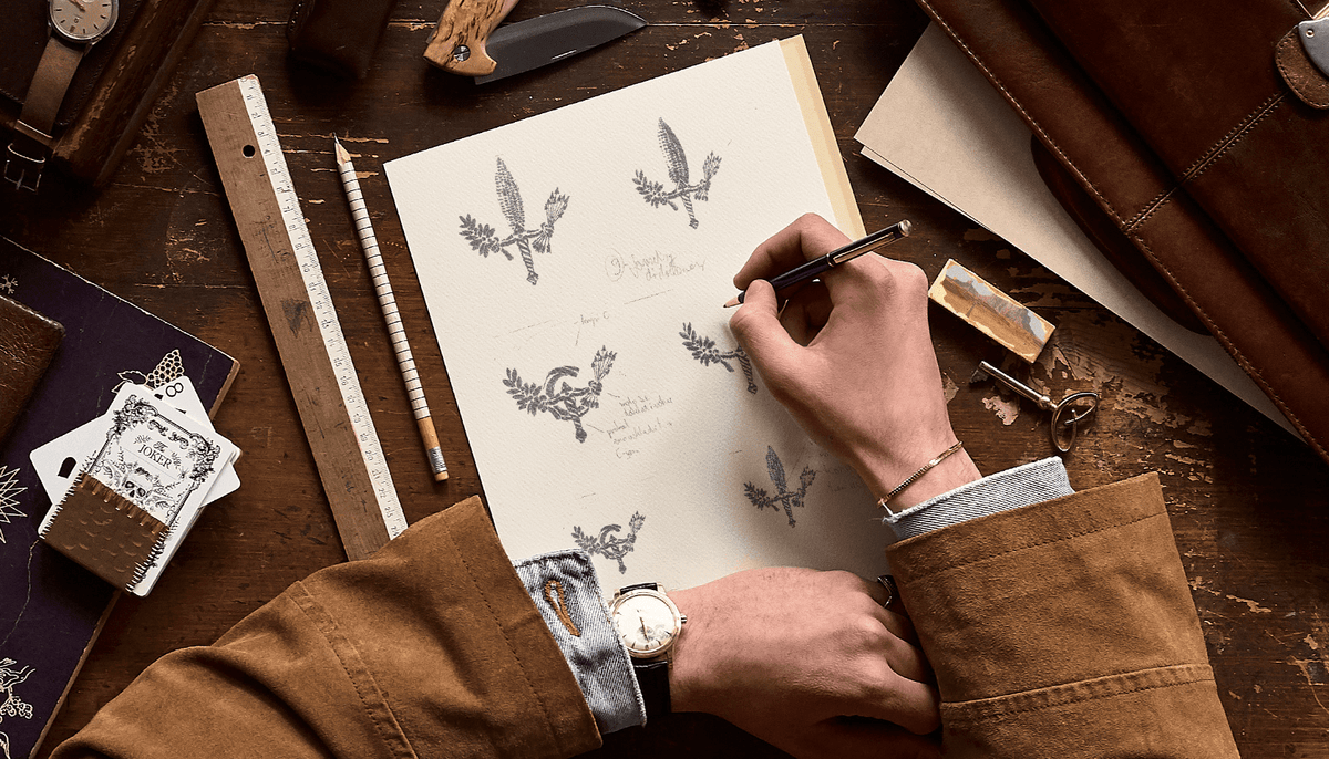
We had the name. “All” we had to do then was come up with some visuals. A crack team of designers brainstormed for months, drew countless iterations, paired labels with bottles, summoned ancient muses, and drank gallons of coffee. Then, they came out of their hermitage and said: "Behold, ye angels, we have created the face of Corn Trooper!"
The idea behind Corn Trooper stands out on the shield-shaped label that represents both the guardianship of Bourbon and the iconic U.S. Interstate road signs.
The yellow road markings that dart diagonally across the label symbolize the route that connects the seven distillers and that quintessential American pastime: road-tripping.
If you look closer and activate your inner Robert Langdon, you'll also notice the seal, which pays homage to the official Seal of the United States. While the latter represents both the nation’s unity and a willingness to defend it, Corn Trooper’s seal conveys harmony among the different Straight Bourbons in the blend and the idea of Corn Trooper as guardian of the Bourbon movement. Our team changed the American eagle to a corn-shaped dagger that’s holding an olive branch in one hand and arrows in the other.
The arrows represent the first seven distilleries that came together to form the Union, bringing all of their strengths with them. The ticket label, on the other hand, extends the road trip imagery reminding us of those old-timey transit tickets. Each distillery is represented once again and each has its own punch hole.
When it came to colors, the Team reverse-engineered the classic design language by sifting through countless labels, putting them all together, and decoding what the basics are and what makes the identity of Bourbon.
They realized not many brands play around when it comes to colors, so they decided to step outside of the norms. Sure, Corn Trooper had to be instantly recognizable as a Bourbon, but it also needed to stand out. They kept the background beige but opted for purple as the main color. It’s a bit different, a bit modern, and not usually seen on Bourbon labels. The yellow color of the road markings complements purple perfectly, too.
In addition to the moniker and the visuals, the bottle is also an important part of Bourbon’s identity. It’s the vessel that holds the Spirit after all. Different shapes of bottles were considered, but when the Design Team agreed on the shield shape for the label, and when 70% of the design was ready, the decision was made to go with this bottle. It had to stand out and shout from the shelf that it holds Bourbon, and we do believe we found the perfect flask.
Countless hours went into finding the perfect representation for Corn Trooper. The same way we were incredibly precise with the juice, we didn’t want to screw up the identity of our first Bourbon. We believe it conveys everything Corn Trooper stands for and we’re pretty proud of it.


